Marketing for health-related causes is tough. You want your message to reach your target audience, properly inform them, and call them to action if necessary. With the chaos in today’s world, it is very easy, almost expected, for your message to be muddled, changed, or lost altogether.
And while some organizations stick to the traditional formula of stock-photo imagery with fear-inflicting text to motivate their audience, others are finding more creative (more effective?) means of communication.
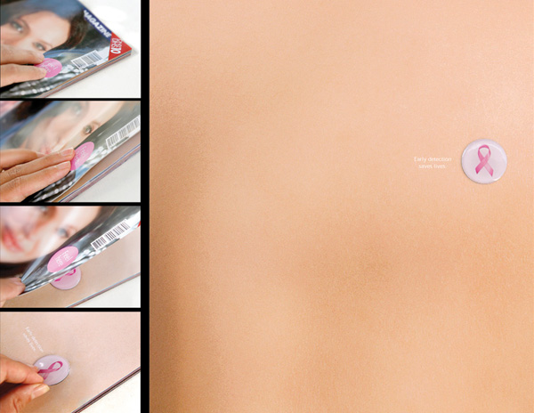
Dubai Healthcare: The photo above is part of the Dubai Healthcare Breast Cancer Awareness campaign. Within the pages of a popular magazine, a small, raised button was placed. On the front cover of said magazine, there was a small pink circle that read “Feel Here.” Once readers flipped to the page with the “lump,” they found a flesh-colored page and simple text that read: “Early detection saves lives.”
Weight Watchers: I have been intrigued and impressed with Weight Watchers’ marketing communications for several years. It seems the company has harnessed the power of encouraging and empowering women instead of condemning them for the weight they have left to lose. This particular flyer was posted in Switzerland. Each time one of the pull-away tabs was torn, the woman pictured “loses weight.” The tabs are an invitation to a Weight Watchers meeting, with the center’s phone number and website.
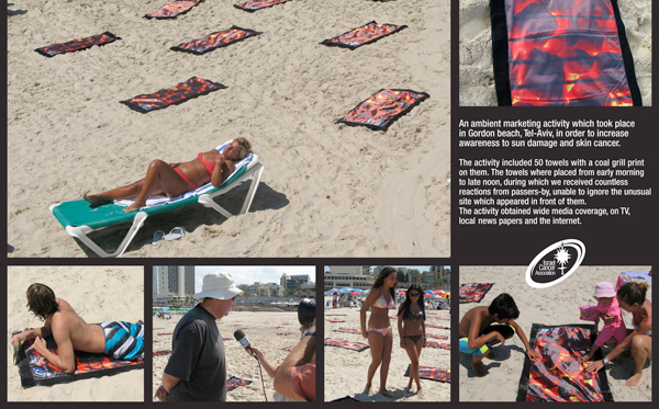
 Israeli Cancer Association: As part of a guerrilla marketing campaign, the Israeli Cancer Association handed out towels resembling hot grills to beach-goers on a hot summer day, informing each recipient of the dangers of skin cancer. This act generated news stories, discussion, and many-a-blog post. With my pale skin, I could not be convinced to lay on that grill-towel. It just looks dangerous.
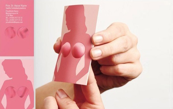
Dr. Kiprov, Plastic Surgeon: Ethics and morals aside, this not-so-“health”-related example is extremely creative, eye-catching and memorable. I am sure Dr. Kiprov’s plastic surgery practice saw an increase in recognition, discussion, and their bottom line. This business card was created by Demner, Merlicek & Bergmann in Austria.
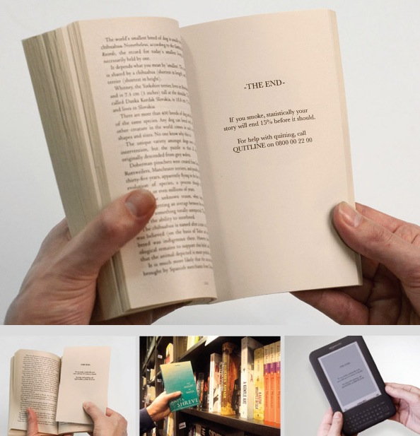
London Smoking Quitline: London advertising agency, Iris London purposefully interrupted readers in both physical books and Kindle editions with a page that read, “The End. If you smoke, statistically your story will end 15% before it should.” Here is one time when interruption is a powerful marketing tactic.
There you have it, five vastly different but equally creative health-related marketing campaigns. What have you seen that’s caught your eye? Do you think these out-of-the-box forms of communication are more effective? More profitable?


[…] post…this one is ladies only! Perhaps take a look at these awesome, unique package designs or these five examples of amazing health-related marketing. Still with me? Okay, but don't say I didn't warn you… Let's talk about periods. (Girls, I think […]