I love packaging. I think visual branding is amazing. When it’s done right, it can be unbelievably beneficial to a company’s recognition, equity, and bottom line. Here are 12 excellent examples of beautiful packaging. Each one tells a story, which is your favorite? (Mine is #7!)
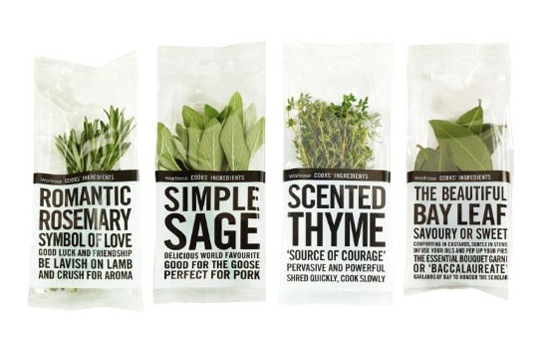
1. Waitrose Herbs || I love the way the packages are beautiful, but also informative.
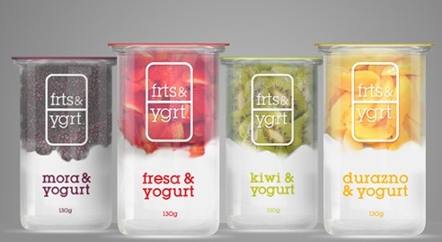
2. Frts&Ygrt || Love the name of the brand, first of all. And the way it’s packaged looks absolutely delicious.
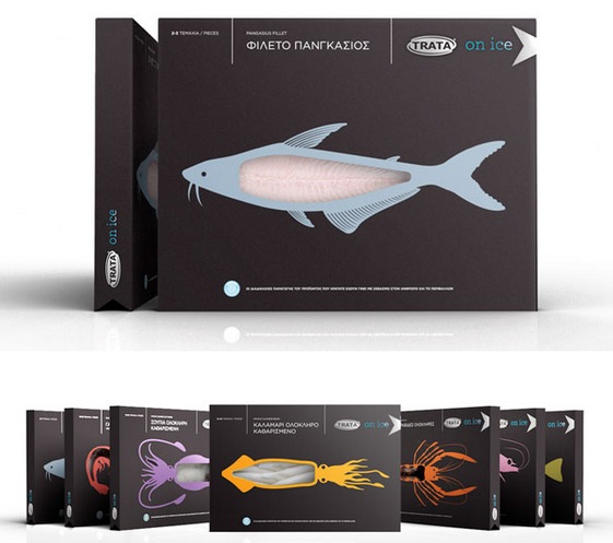
3. Trata On Ice || I hate seafood, except for crabs from Maryland. But if I were to like the stuff, it would be because I bought it in the packaging pictured below.
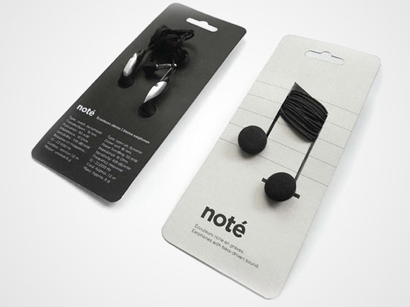
4. Noté || This packaging was originally created because the company wanted to reduce the plastic waste used to package headphones. Lovely.
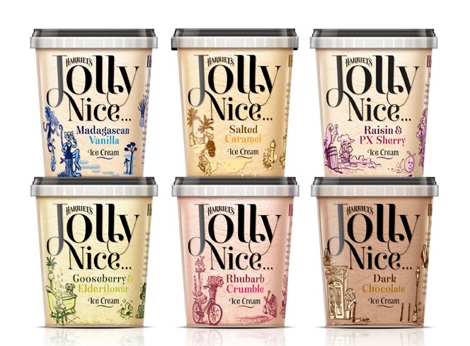
5. Harriet’s Jolly Nice Ice Cream || A little whimsical, a little quirky, all-around well done. The flavors sound great, too!
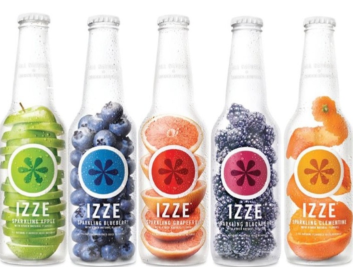
6. Izze Sparkling Juice || One word: yum! Talk about packaging selling your product for you.
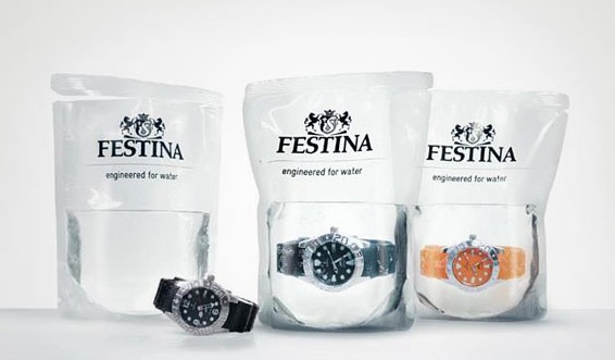
7. Festina Watches || This is my favorite. Absolutely genius. The watches are marketed as highly waterproof, so they are sold in pouches of water. The confidence the creators have in their product is wonderful and rare.
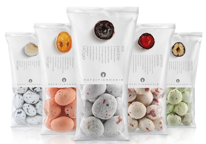
8. Hatziyiannakis Dragee Candy || Apparently a household name in Greece, this candy manufacturer rolled out their well-known product in sleek, modern packaging.
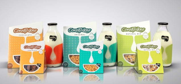
9. Milky || As part of a design contest, the winner created this packaging for cereal and milk. Such a neat concept, and very eye-catching, especially since cereal and milk packages are usually so similar to one another (read:boring).
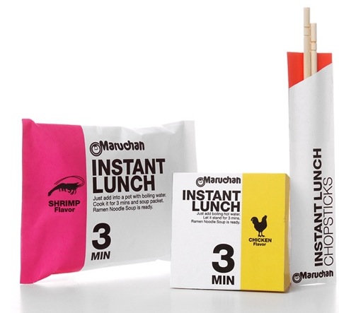
10. Maruchan Instant Lunch || This trumps the current Ramen packaging big time.
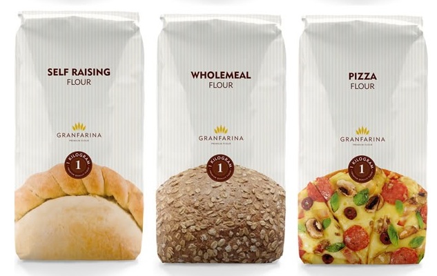
11. Granfarina || This clear, simple packaging proves that even household staples can be presented beautifully.
12. Spaghetti Redesign || As part of a school project, Alex Creamer was asked to redesign a spaghetti box. This is what he came up with–it is awesome.
There are many, many more examples of beautiful and unique packages out there, especially on Pinterest, where I was able to find links to many of the packages I featured on this post. Please, comment below and share your favorite!
Be sure to “Like” my Facebook page to keep up with me as we head into summer!

love this post Blair. I’d like to follow you as well but for some odd reason, I can’t seem to determine how to do this. Ideas? I got your blog URL from the Elon thread on LinkedIn.
Thanks for checking out my blog. I looked at your earlier today from the same LinkenIn thread…how funny!
If you scroll to the bottom of my site, there is a “subscribe” option, where my latest posts will be emailed to you.
xo,
b
LOL I loved the last box! SO unique! Packages also come to my attention whenever I buy something.. who doesn’t love beautiful packaging??
The last box is brilliant, I agree! Thanks for commenting, Rebecca.
xo,
b
Blair — laughing. I am a package sucker too:-) As you note, packaging can work hard for a brand — perhaps why Steve Jobs trademarked Apple packaging. .15 out of every $1 spent on product development better contribute to the bottom line … and I think your examples do. Your Blog set a standard — and I will continue to follow you!
Goes without saying that I am grateful to have had Blair Menzel in three classes at Elon. You were a delight and a great addition to the forum.
Hope we’ll be in close touch as you launch in the wild blue yonder … you are destined for great things!
Best,
Prof. Mac